Cool Watercolor material with Eevee
Learn how to make your 3D models look like watercolor paintings with the ever useful shader-to-rgb node. If you prefer text tutorials, you can read the text version below.
The trick behind this watercolor material is to make it look like the objects are painted on a piece of paper rather than an object in a 3D space. So the first step is to add a proper paper background. Let’s hop into the wold editor.
World and settings
You can download the paper texture here. We want it to always look the same, so objects look painted on top of it. To get that effect let’s add a texture coordinate node and plug in the window coordinates. You can also use a mapping node to move it around and reposition it. Finally I’m going to desaturate it a bit and fiddle with the contrast using the curves node.

Now, we don’t want the paper messing around with our lighting. So we need to disable it for everything except the camera. We’ll use the old light path trick for this. Mix the paper texture using the Is Camera Ray output with pure black. Now we can have one color for the lighting and another for what the
camera sees.

We’ll use this texture again when we make the objects materials so let’s put it a nodegroup. Don’t forget to throw some lights around your object so you can see their effect on the material!
Watercolor Material
Alright, material time. Let’s add a new one and get rid of the principled shader. We are going to work this the same way we would do a watercolor painting: from light to dark. That means we let the paper show
through the light areas and cover the shadows and edges to suggest the form. And to do this we will be mixing things on top of the paper texture using multiply.
Bring back the paper node we made before, and plug it into an emission shader. Check it out: since the textures in the material and world are in sync we can’t see the model anymore. Now let’s get started with the edges. Add a layer weight node and lower the blend to about 0.2.

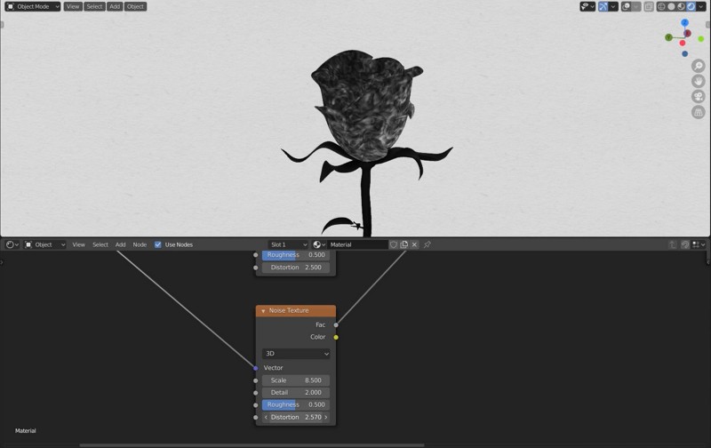
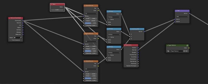
We have to distort this to make it look like paint. We’ll have to make a vector that we can plug into the normal socket of the layer weight that will look more like watercolor. Add three noise nodes (one for each axis), a combine vector node and texture coordinates. Plug everything together and the result of the combine vector in the layer weight. Play around with the noises, you want to bring up the distortion setting but not too much. Otherwise it gets too messy.

With these done, we need to get the shape of the object back. So let’s bring a geometry node and a vector math node and combine them with our painterly normals.

It’s also useful to control the intensity of this effect. So drop some math nodes for each noise and set them to multiply. Then add a value node to control the amount to multiply. I’ve found that 0.7 looks good enough.

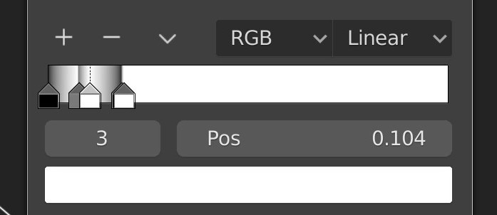
Back to the layer weight node. We’ll add a colorramp to control it, set it to bspline to make it smooth. Now the trick to get a watercolor effect is to make the transition areas between colors go zig zag between dark and bright so the transitions are dark. I got this trick from Hadyn Lander’s watercolor unity shader.
Let’s add another colorramp set to constant to add harder edges. We can mix these two using a math node set to multiply.

There’s one more thing left to do here. I think it looks better when watercolor paint seems to flow and around. We can use the window coordinates to get that effect. Add them with a Vector Math node the same way we did before.
Alright, let’s get the lighting information now. Bring back the principled shader and plug the painterly normals in there. Add a shader-to-rgb node so we can convert the shader result into an image and plug it into a colorramp.

Now here’s the trick to get that watercolor look.
Just like before, we want to jump between dark and light. This time we’ll have more colors stop, and packed tighter. You might have to zoom in real close for this. It also might be different depending on the lighting in your scene.

Mix all these together using the mixRGB node set to (you guessed it) multiply.

Adding color
Time to add some color to bring this effect together. Add another colorramp in the principled shader area. Set it to bspline to make it smooth. Pick some colors suitable for your model and try to play with some hue variation besides value. These are the colors I used for the rose: #9B3E72, #D5A781 and white

Let’s add a final colorramp for the edges, again using bspline. This one needs to be a bit more subtle than before so the hard edges don’t stand out too much. These are the colors I used: #FFC1D2 and white

Hope you enjoyed this tut. Did you make something cool? Let me know in the comments!
Batch rendering is complicated
But it doesn’t have to be! Render+ lets you setup, run batches and a whole lot more from the comfort of Blender’s interface.
Try out Render+ today!